

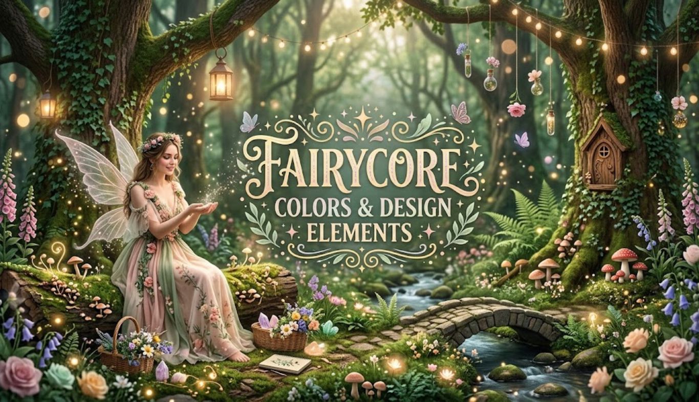
Fairycore is an aesthetic inspired by enchanted forests, wildflower meadows, tiny cottages, folklore, moonlit gardens, and the quiet beauty of nature. Rather than relying on one strict set of rules, it combines romantic details with organic textures and soft, slightly mysterious colors. At the heart of the aesthetic are fairycore colors & design elements that make a space, outfit, illustration, or digital project feel gentle and otherworldly. Think moss green beside faded rose, cream linen beside weathered wood, or lavender paired with a dusky blue. The result doesn’t need to look childish or overly decorative. In fact, the most successful fairycore designs often feel natural first and magical second.
Color matters because it establishes the emotional foundation of a design. Designers commonly use relationships such as analogous and complementary colors to create harmony or contrast. Adobe’s overview of color theory, for example, explains how the color wheel helps creators understand these relationships and choose combinations with greater confidence. The good news is that fairycore doesn’t require expensive furniture, designer clothing, or a complete makeover. A few carefully chosen colors and tactile details can change the entire mood.
Understanding the Fairycore Color Philosophy
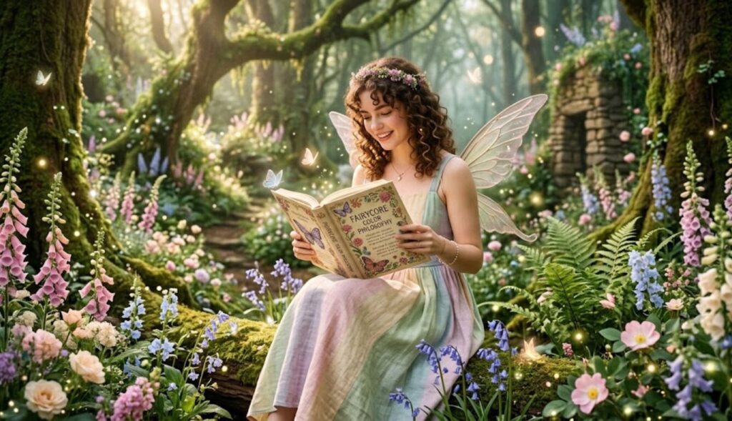
Why Soft Colors Define the Aesthetic
Fairycore usually favors colors that appear slightly softened, faded, dusty, or naturally occurring. Extremely bright neon shades generally feel out of place because they create a sharp, energetic mood rather than a quiet, enchanted one.
Instead, consider:
- Sage green
- Moss green
- Fern green
- Dusty rose
- Blush pink
- Lavender
- Lilac
- Powder blue
- Cream
- Ivory
- Warm beige
- Mushroom brown
- Muted gold
These colors don’t have to be pale. A deep forest green can work beautifully alongside a light cream, while burgundy can provide a mysterious woodland accent.
The Role of Green in Fairycore
Green is arguably the foundation of fairycore color schemes because it connects the aesthetic directly to nature. Moss, leaves, ferns, vines, grass, and forest canopies all provide natural inspiration. A muted green also acts as a flexible background color. It can support warmer shades such as peach and rose or cooler shades such as lavender and blue.
For a sophisticated look, try pairing: Sage green + cream + dusty rose + aged brown
For a darker enchanted-forest interpretation, use: Forest green + mushroom brown + muted gold + deep plum
Pink, Lavender, and Rose
Pink gives fairycore its romantic side. However, instead of relying entirely on bubblegum pink, choose shades that appear slightly weathered.
Dusty rose, antique pink, muted blush, and faded mauve are particularly useful. Lavender and lilac add a dreamy quality without making the palette too sweet. A practical rule is to let one soft pink or purple shade act as an accent rather than covering everything in it.
Earth Tones Keep the Palette Grounded
Earth tones prevent fairycore from becoming visually overwhelming. Warm beige, tan, mushroom, cocoa, clay, and muted brown create a connection with tree bark, soil, dried flowers, baskets, and old cottages.
This balance is important. A palette made entirely from pastel colors can feel more like generic pastel decor than fairycore. Adding earthy shades gives the design a sense of place.
Building Beautiful Fairycore Color Palettes
A Simple 60-30-10 Approach
One easy way to organize fairycore colors & design elements is to use a basic proportion system:
- 60% dominant color: usually cream, sage, beige, or another soft neutral
- 30% secondary color: lavender, dusty rose, woodland green, or muted blue
- 10% accent color: gold, burgundy, plum, or soft peach
This prevents every color from competing for attention. For example, a bedroom might use cream walls and bedding as the dominant color, sage curtains and greenery as the secondary color, and antique gold hardware as the accent.
Twelve Enchanting Fairycore Color Ideas
| Palette | Main Colors | Best Use |
|---|---|---|
| Woodland Fairy | Moss, cream, brown | Interiors |
| Rose Garden | Dusty rose, sage, ivory | Fashion |
| Moonlit Forest | Deep green, navy, silver | Bedrooms |
| Lavender Meadow | Lilac, sage, cream | Digital design |
| Cottage Fairy | Beige, blush, olive | Home decor |
| Enchanted Berry | Plum, rose, moss | Accessories |
| Morning Dew | Powder blue, cream, sage | Soft interiors |
| Wildflower | Lavender, yellow, green | Creative projects |
| Autumn Fairy | Rust, moss, cream, brown | Seasonal styling |
| Moonflower | Mauve, midnight blue, ivory | Evening themes |
| Golden Grove | Forest green, beige, muted gold | Elegant decor |
| Fairy Garden | Mint, blush, lavender, cream | Youthful designs |
How to Mix Warm and Cool Shades
A fairycore palette becomes more interesting when warm and cool colors are balanced. For example, sage green is relatively cool, while dusty rose has a warmer character. Pairing them creates gentle visual contrast without the intensity of a traditional complementary scheme.
Color theory provides useful guidance here. Analogous colors sit near each other on the color wheel and tend to produce harmonious combinations, while complementary colors create stronger contrast.
When to Use Dark Fairycore Colors
Fairycore doesn’t always have to be light and airy. Dark fairycore, sometimes called enchanted forest or gothic fairycore, can use:
- Deep emerald
- Charcoal
- Burgundy
- Midnight blue
- Plum
- Dark chocolate
- Antique gold
The trick is to maintain softness through texture and lighting. A dark green velvet cushion, for instance, feels more magical when paired with warm lamps, cream textiles, and natural wood.
Design Elements That Complete the Fairycore Look
Natural Materials
Color alone won’t create a convincing fairycore atmosphere. Materials are equally important. Wood, rattan, wicker, linen, cotton, stone, ceramic, and aged metal all reinforce the connection to nature. Whenever possible, choose materials with visible texture rather than perfectly polished surfaces.
A distressed wooden shelf can feel more appropriate than a glossy modern cabinet. A linen curtain can create more atmosphere than synthetic fabric. These small choices add authenticity.
Botanical Details
Flowers and plants are central to fairycore because they introduce irregular, organic shapes.
Good choices include:
- Dried wildflowers
- Ferns
- Ivy
- Lavender
- Baby’s breath
- Moss-inspired arrangements
- Pressed flowers
- Botanical prints
- Leaf-shaped decorations
You don’t need dozens of plants. One climbing vine around a bookshelf or a small vase of dried flowers may be enough.
Lace, Embroidery, and Soft Fabrics
Lace adds delicacy, while embroidery introduces craftsmanship. Floral embroidery on cushions, curtains, clothing, or wall art can instantly strengthen the theme.
Other useful materials include:
- Crochet
- Gauze
- Velvet
- Muslin
- Linen
- Cotton
- Tulle
- Sheer fabrics
Layering these textures creates depth. A sheer curtain over a heavier linen curtain, for example, can create a soft filtered-light effect.
Lighting Creates the Enchanted Mood
Lighting may be one of the most overlooked fairycore design elements.
Harsh overhead lighting can flatten an otherwise beautiful space. Instead, use multiple gentle sources:
- Warm table lamps
- Small string lights
- Candles or candle-style LED lights
- Lantern-inspired fixtures
- Soft bedside lamps
- Natural daylight
Warm lighting works particularly well with cream, brown, rose, and green because it emphasizes their softer qualities.
Vintage and Handmade Details
Fairycore often looks best when objects appear collected rather than purchased as one matching set.
Try incorporating:
- Vintage frames
- Small ceramic dishes
- Antique-style mirrors
- Botanical books
- Hand-painted boxes
- Woven baskets
- Old-looking clocks
- Handmade pottery
A little imperfection goes a long way. The aesthetic is supposed to feel lived-in and discovered, not manufactured in one afternoon.
Applying Fairycore to Fashion, Interiors, and Digital Design
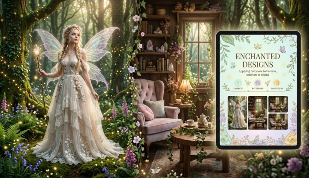
Fairycore Fashion
In clothing, fairycore colors & design elements can be translated into flowing silhouettes, floral prints, layered fabrics, and natural colors.
Popular combinations include: Cream + sage + dusty pink This works well for dresses, skirts, cardigans, and accessories. Lavender + ivory + muted green This creates a lighter, more ethereal look.
Brown + forest green + cream This is excellent for an autumnal woodland style. Useful clothing details include puff sleeves, embroidery, lace collars, long skirts, floral patterns, ribbons, knitted pieces, and delicate jewelry. You don’t have to wear a full fairycore outfit, either. A normal outfit can become more whimsical through a floral scarf, vintage-style cardigan, botanical jewelry, or earthy color palette.
Fairycore Interior Design
For a fairycore bedroom, start with a calm neutral base. Cream, warm white, beige, or pale sage makes an excellent foundation. Then add layers.
Walls: cream, pale sage, muted lavender, or warm beige.
Bedding: floral patterns, linen, cotton, quilts, or soft layered blankets.
Furniture: natural wood, painted vintage pieces, wicker, or rattan.
Decor: plants, botanical art, small lamps, mirrors, books, flowers, and handmade objects.
Accent colors: dusty rose, lavender, muted gold, or forest green. Don’t worry if the room isn’t perfectly coordinated. A little variety can actually make the space feel more believable.
Fairycore Digital and Graphic Design
The aesthetic also works extremely well for websites, social media graphics, invitations, mood boards, packaging, and illustrations. Use a limited palette rather than filling every corner with decoration.
A practical digital palette might be:
- #E8E0D0 — warm cream
- #A8B59A — sage
- #C99A9A — dusty rose
- #A99BC5 — muted lavender
- #6E7658 — woodland green
- #8A725D — mushroom brown
Pair these colors with delicate botanical illustrations, textured backgrounds, serif typography, subtle borders, and organic shapes. For readability, however, make sure text has enough contrast against its background. A beautiful palette still needs to function well.
Fairycore for Weddings and Events
Fairycore can create an especially romantic event theme. Imagine cream tablecloths, greenery, wildflowers, antique gold candleholders, handwritten place cards, and soft pink floral arrangements.
A simple event palette could be: Ivory + sage + dusty rose + antique gold
For a more dramatic evening event: Forest green + plum + champagne + warm ivory The important thing is consistency. Repeat the same two or three core colors across invitations, flowers, table settings, signage, and clothing details.
Common Fairycore Design Mistakes to Avoid
Using Too Many Pastels
Pastels are useful, but every element doesn’t need to be pastel. Without contrast, the design can become flat. Add a deeper shade such as forest green, brown, plum, or muted blue.
Making Everything Look Artificial
Fairycore is rooted in nature. Plastic-looking plants, overly glossy finishes, and identical decorative objects can weaken the effect. Choose materials with tactile character whenever possible.
Overloading the Room
Fairycore encourages decoration, but clutter isn’t the same as atmosphere. Give important objects room to breathe. A small arrangement of flowers can be more effective than covering every surface.
Forgetting Function
Aesthetic design still needs to be practical. A bedroom should remain comfortable. A website should remain readable. Clothing should remain wearable. A dining table should still have enough space for dinner. Beauty works best when it supports everyday life.
Using Contrast Without Balance
Dark green and burgundy can look wonderful together, but too much of both may make a room feel heavy. Balance rich colors with cream, warm white, pale beige, or natural wood.
How to Create Your Own Fairycore Style
Step 1: Choose Your Fairycore Mood
Decide what kind of fairycore you want.
Do you prefer:
- Bright meadow fairycore?
- Woodland cottage fairycore?
- Romantic garden fairycore?
- Dark enchanted forest?
- Vintage fairycore?
- Minimal fairycore?
This decision will guide your colors.
Step 2: Pick Three Core Colors
Choose one dominant color, one supporting shade, and one accent.
For example: Sage + cream + dusty rose Don’t add five more colors immediately. Start small.
Step 3: Add Natural Texture
Introduce wood, linen, wicker, cotton, stone, dried flowers, or ceramic pieces. Texture can make even a simple palette feel rich.
Step 4: Introduce One Magical Detail
This could be a moon-shaped mirror, fairy lights, a floral illustration, an antique frame, a whimsical lamp, or delicate embroidery. One unusual detail can create more impact than ten generic decorations.
Step 5: Layer Carefully
Fairycore looks best when elements feel collected over time. Layer textiles, plants, artwork, lighting, and small objects gradually. If something starts to feel excessive, remove one piece and see whether the composition improves.
Step 6: Trust Your Own Interpretation
There isn’t a single correct version of fairycore. Some people prefer pale pinks and flowers. Others prefer moss, mushrooms, deep greens, and woodland textures. Both approaches can work. The strongest designs usually have a recognizable personal touch.
Frequently Asked Questions
1. What are the main fairycore colors?
The most recognizable fairycore colors include sage green, moss green, cream, ivory, dusty rose, blush, lavender, lilac, powder blue, beige, mushroom brown, and muted gold. Deeper shades such as forest green, plum, and burgundy can be used for a darker interpretation.
2. What color combination is best for fairycore?
A versatile combination is sage green, cream, and dusty rose. It feels natural, romantic, and soft without becoming overly sweet. For a woodland look, try forest green, mushroom brown, cream, and muted gold.
3. Can fairycore use dark colors?
Absolutely. Dark fairycore can use emerald, forest green, burgundy, plum, chocolate brown, navy, and charcoal. Balance these shades with warm lighting, cream textiles, natural materials, or lighter botanical accents.
4. Is fairycore the same as cottagecore?
They’re related but aren’t identical. Cottagecore focuses strongly on rural life, traditional crafts, domestic simplicity, and countryside living. Fairycore adds more fantasy, folklore, magical woodland imagery, delicate details, and an otherworldly atmosphere.
5. How do I make my bedroom fairycore?
Start with a soft neutral or sage base. Add natural wood, floral bedding, plants, warm lighting, sheer curtains, woven baskets, vintage-style decor, and delicate botanical artwork. You don’t need to replace everything; small layered details can make a major difference.
6. What colors should I avoid in fairycore design?
There aren’t absolute rules, but neon colors and extremely saturated synthetic-looking shades can conflict with the softer natural mood. If you want to use a bright color, make it a very small accent.
7. Can fairycore be minimalist?
Yes. Minimal fairycore focuses on quality rather than quantity. Use a restrained palette, natural materials, one or two botanical details, soft lighting, and a few carefully chosen decorative pieces.
8. What materials work best with fairycore?
Wood, linen, cotton, lace, crochet, wicker, rattan, ceramic, stone, velvet, and aged metal are excellent choices. These materials add texture and support the nature-inspired character of the aesthetic.
9. How can I use fairycore colors in graphic design?
Choose three to six colors and establish a clear hierarchy. Use cream or another soft neutral as the background, a muted green or purple as the supporting color, and a dusty pink, gold, or deeper woodland shade as an accent. Keep typography readable and avoid overcrowding the composition.
10. Does fairycore have to include fairy images?
Not at all. Fairycore is more about atmosphere than literal fairy imagery. Flowers, forests, vintage objects, soft colors, natural textures, moonlight, and handcrafted details can communicate the aesthetic without showing a single fairy.
Conclusion
The beauty of fairycore is that it doesn’t demand perfection. Its charm comes from softness, nature, texture, imagination, and carefully chosen details. The most effective fairycore colors & design elements usually begin with a calm foundation such as cream, sage, beige, or muted green. From there, dusty pink, lavender, powder blue, woodland brown, or antique gold can add personality. Natural materials, botanical details, vintage objects, warm lighting, lace, embroidery, and handmade textures then transform a simple color palette into something genuinely enchanting.
Whether you’re designing a bedroom, choosing an outfit, creating a website, planning an event, or building an illustration style, start with the mood you want to create. Pick a small color palette, introduce natural textures, and add a few unexpected details. Above all, don’t be afraid to make fairycore your own. A woodland-inspired design can be elegant, romantic, mysterious, playful, or minimalist. Once you understand the basic principles, you can bend the rules without losing the magic.