

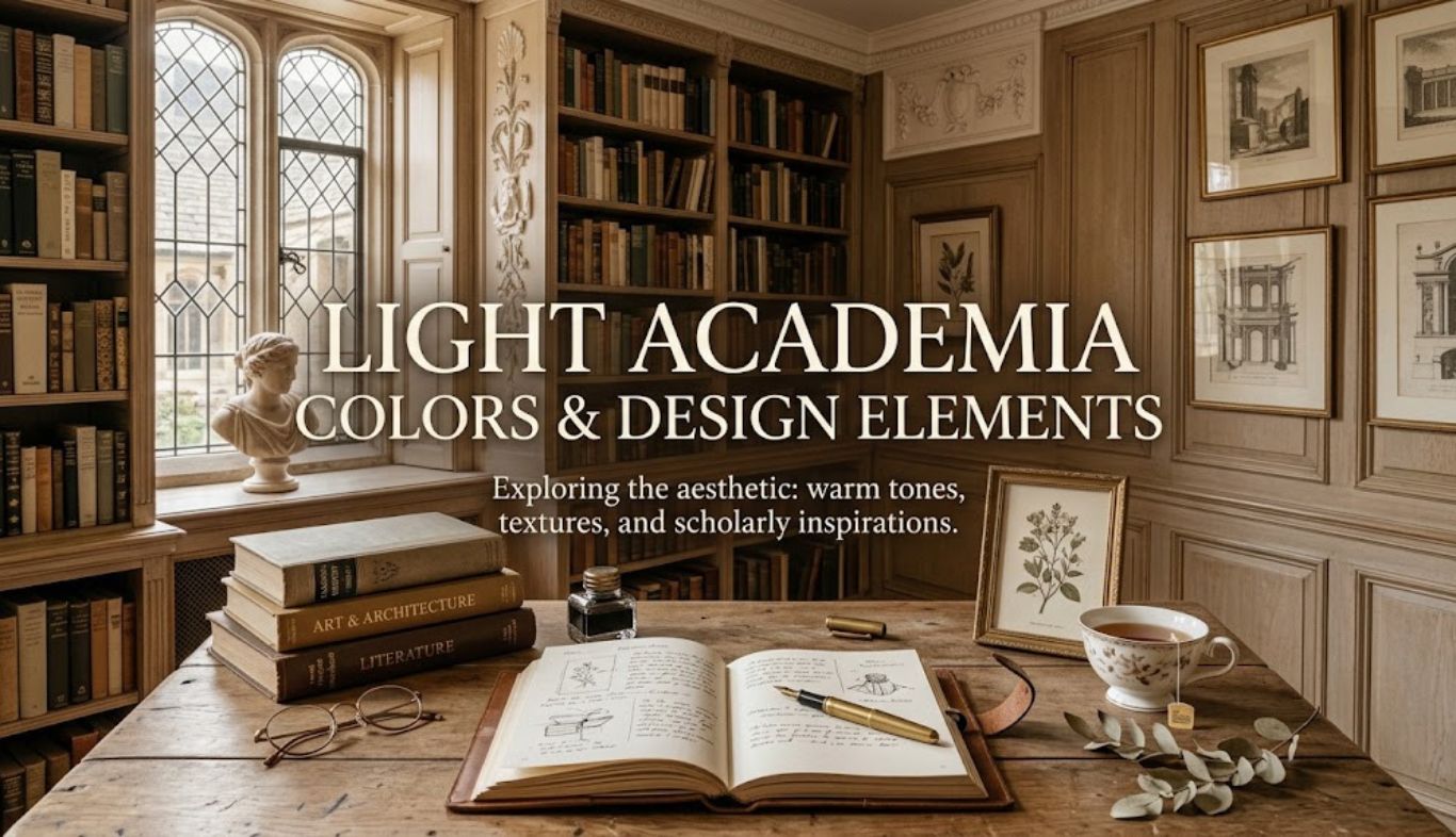
Light academia is more than a decorating trend. It’s a visual language inspired by old libraries, classical architecture, handwritten letters, art studios, university halls, poetry, and quiet afternoons spent reading by a window. The style combines intellectual charm with warmth, creating spaces that feel cultured without becoming overly formal. At the heart of this aesthetic are Light Academia Colors & Design Elements. Cream, ivory, beige, warm white, muted sage, dusty rose, faded blue, caramel, and soft brown provide the foundation. These shades work particularly well because they create a calm background while allowing books, artwork, antique objects, textiles, and architectural details to become part of the story.
Unlike darker academia styles, light academia doesn’t depend on dramatic black, charcoal, or deep burgundy. Instead, it celebrates daylight, softness, natural textures, and an understated sense of history. Whether you’re redesigning a bedroom, study, living room, office, or creative corner, the right combination of color and design elements can make the space feel both sophisticated and inviting.
What Is Light Academia Interior Design?

Light academia is an interior and lifestyle aesthetic influenced by classical education, literature, history, art, and European-inspired interiors. Its visual identity is softer and brighter than traditional dark academia. Think of an old university reading room—but imagine it filled with morning sunlight rather than candlelight.
The style often includes:
- Classical or vintage-inspired furniture
- Natural wood
- Cream and ivory walls
- Aged books
- Framed artwork
- Brass or antique-metal accents
- Linen curtains
- Botanical elements
- Handwritten stationery
- Traditional lamps
- Persian-style or faded rugs
- Ceramic objects
- Architectural molding
- Soft, layered textiles
The goal isn’t to make a room look like a museum. Instead, it should feel lived-in, thoughtful, collected, and personal. One reason the aesthetic has become popular is its flexibility. You don’t need an enormous historic house or expensive antiques. A secondhand wooden desk, a linen lampshade, a stack of classic books, and a carefully selected paint color can establish the mood.
Light Academia vs. Dark Academia
The two aesthetics share many characteristics, including literature, vintage design, classical references, and scholarly themes. Their color palettes, however, create very different emotional effects.
Dark academia generally favors espresso brown, black, forest green, oxblood, navy, and charcoal. Light academia uses cream, warm white, taupe, soft tan, dusty blue, muted green, and pale pink. That difference matters.
Dark shades create drama, mystery, and visual weight. Light Academia Colors create openness, softness, and serenity. You can also combine the two. For example, a cream wall with a dark walnut desk and antique brass lamp creates a sophisticated middle ground.
The Essential Light Academia Colors & Design Elements Palette
The foundation of Light Academia Colors is a collection of warm, muted shades rather than highly saturated colors. The palette should feel slightly aged, natural, and comfortable.
| Color | Suggested Hex | Best Use |
| Warm Ivory | #F4EFE3 | Walls and ceilings |
| Soft Cream | #EDE3CF | Furniture and textiles |
| Oatmeal | #D8CBB5 | Rugs and upholstery |
| Warm Beige | #CBBBA0 | Walls and curtains |
| Taupe | #A99A84 | Accent furniture |
| Walnut Brown | #6B4F3A | Desks and shelving |
| Muted Sage | #A7AD91 | Accent walls and textiles |
| Dusty Blue | #A9B7BE | Artwork and accessories |
| Dusty Rose | #C9A6A0 | Decorative accents |
| Terracotta Beige | #B98A6A | Ceramics and small accents |
| Antique Brass | #B08D57 | Hardware and lighting |
These colors don’t need to appear equally. In fact, they shouldn’t. A successful room usually has one dominant neutral, two or three supporting colors, and a handful of darker accents.
For example, you could use warm ivory for the walls, oatmeal for upholstery, walnut brown for furniture, muted sage for cushions, and antique brass for lighting.
Warm White and Ivory
Warm white is one of the most useful colors in this aesthetic. Pure white can sometimes appear too stark and contemporary, particularly next to vintage furniture. Ivory has a softer appearance.
Use it on:
- Walls
- Ceilings
- Trim
- Curtains
- Bedding
- Upholstered chairs
- Picture mats
If your room receives cool northern light, warmer ivory can prevent the space from feeling gray.
Beige, Taupe, and Oatmeal
Beige provides the bridge between white walls and wooden furniture. However, avoid using a single flat beige everywhere. Layer different temperatures and textures instead. An oatmeal rug, taupe chair, cream wall, and beige linen curtain can create depth without relying on strong contrast.
Muted Green
Muted sage and olive-gray are excellent secondary shades. They introduce nature without overwhelming the neutral foundation.
Sage works particularly well with:
- Walnut
- Brass
- Cream
- Terracotta
- Linen
- Aged paper tones
A sage-green desk chair or botanical print may be enough to introduce the color.
Dusty Blue
Dusty blue adds a scholarly, slightly nostalgic quality. It’s especially effective in bedrooms and reading areas. Try pairing it with cream walls, dark wood, aged brass, and off-white textiles.
Dusty Rose
Pink can work beautifully in light academia when it’s muted rather than bright. Think faded rose petals, old wallpaper, or antique fabric rather than candy pink. Use dusty rose sparingly through cushions, artwork, flowers, ceramics, or a small upholstered piece.
Why These Colors Work Together
Color psychology plays an important role in creating a successful room. Warm neutrals tend to feel grounded and comfortable, while soft greens and blues can introduce a sense of calm. However, color isn’t experienced in isolation.
The same cream paint may look completely different beside polished chrome than it does beside aged oak. Similarly, dusty blue can feel contemporary when paired with bright white and geometric furniture but vintage when surrounded by walnut and antique brass. That’s why Light Academia Colors work best when considered alongside materials and lighting.
A practical rule is the 60-30-10 approach:
- 60%: dominant neutral
- 30%: secondary color or material
- 10%: accent shade
For example:
- 60% cream and ivory
- 30% walnut and beige
- 10% sage and antique brass
This creates visual hierarchy without making the room look overly coordinated.
Designing Walls and Architectural Details
Walls provide the largest uninterrupted color field in most rooms, so they’re an ideal starting point. Warm ivory, parchment, soft beige, and pale taupe are reliable choices. If the room already has architectural character—such as crown molding, paneling, tall windows, or built-in shelving—keep the wall treatment relatively restrained. The architecture should do some of the decorating for you.
Paneling and Molding
Traditional wall paneling can instantly strengthen the academia atmosphere. You don’t necessarily need elaborate woodwork, either. Simple rectangular molding painted in the same color as the wall can add subtle depth.
For a more dramatic effect, paint the wall and molding in slightly different tones. For example:
- Wall: warm ivory
- Trim: creamy white
The contrast will be gentle but noticeable.
Bookshelves as Architectural Features
Floor-to-ceiling shelving creates an immediate intellectual focal point.
Natural wood is ideal, particularly:
- Oak
- Walnut
- Mahogany-inspired finishes
- Painted cream
- Aged pine
Don’t fill every shelf completely. Leave breathing room between books and decorative objects. A shelf can include books, framed sketches, small busts, ceramics, dried flowers, and antique-style boxes. The objective is curated abundance—not clutter.
Furniture That Complements the Aesthetic
Furniture is where Light Academia Colors gain visual weight. Wooden furniture should generally have visible grain rather than an ultra-glossy finish. A slightly aged or matte surface works particularly well.
Consider:
- Writing desks
- Ladder-back chairs
- Upholstered armchairs
- Wooden bookcases
- Pedestal tables
- Traditional side tables
- Storage trunks
- Antique-style cabinets
A writing desk is especially effective because it connects directly with the academic theme. Choose a desk with enough space for books, notebooks, stationery, and a traditional desk lamp. Then add one or two personal objects rather than filling the entire surface.
Mixing Wood Tones
You don’t have to match every wooden item. A room can combine oak, walnut, and lighter natural wood if the finishes share a similar warmth. The trick is repetition. If you have a walnut desk, repeat that brown through a picture frame, chair detail, bookshelf, or small decorative object.
Textiles and Soft Materials
Textiles prevent an academia-inspired room from feeling stiff. Linen is one of the strongest choices because it has a relaxed, natural appearance. Cotton, wool, velvet, and woven materials can also work well.
For bedding, consider:
- Cream linen duvet covers
- Ivory sheets
- Beige throws
- Dusty-blue cushions
- Sage pillows
- Subtle floral patterns
Avoid overly polished fabrics when possible. The aesthetic benefits from materials that look touchable and slightly imperfect.
Curtains
Floor-length curtains in linen or cotton can soften windows and emphasize vertical height. Cream, oatmeal, pale beige, and muted gray-green are particularly useful.
If privacy allows, lightweight curtains can also make the room feel brighter by filtering sunlight instead of blocking it completely.
Lighting: The Secret Ingredient
Even the perfect palette can fail under harsh lighting. Light academia depends heavily on soft illumination.
Use several layers:
- Natural daylight
- Ceiling or pendant lighting
- Desk lighting
- Floor lamps
- Table lamps
- Candlelight or decorative alternatives
Warm bulbs generally work better than very cool white bulbs because they reinforce cream, beige, wood, and brass. A traditional desk lamp with an aged-metal finish can become both a practical object and a decorative focal point.
Make Natural Light a Feature
Arrange reading chairs and desks near windows whenever practical. Use mirrors strategically to reflect daylight. A large vintage-style mirror can make a smaller room feel brighter while reinforcing the traditional character. Don’t cover beautiful windows with heavy curtains during the day unless necessary.
Decorative Elements That Complete the Look
The difference between a generic neutral room and an authentic academia-inspired interior often comes down to accessories. The best objects suggest curiosity, creativity, and history.
Consider:
- Old-looking books
- Botanical illustrations
- Classical artwork
- Maps
- Vintage clocks
- Ceramic vases
- Brass candlesticks
- Wooden boxes
- Fountain pens
- Sketchbooks
- Globes
- Small sculptures
- Dried flowers
- Framed handwritten notes
You don’t need all of these. In fact, using too many themed objects can make the room look like a costume set. Select pieces that genuinely fit your personality.
For inspiration on historical design and art, resources such as the Victoria and Albert Museum can be useful when researching traditional decorative styles.
Artwork for a Scholarly Atmosphere
Artwork should feel collected rather than mass-produced. Landscape paintings, botanical studies, portraits, architectural drawings, classical reproductions, and still lifes are all suitable. A gallery wall can work especially well.
Try mixing:
- Large and small frames
- Wood and brass finishes
- Paintings and sketches
- Portraits and landscapes
- Horizontal and vertical compositions
Don’t worry if everything isn’t perfectly symmetrical. A little visual irregularity makes the arrangement feel more personal.
Bringing Light Academia Colors Into the Bedroom
The bedroom is arguably one of the easiest places to introduce this aesthetic because textiles already occupy a large portion of the room. Start with warm ivory or cream bedding. Then introduce two accent colors, such as dusty blue and sage.
For example:
- Cream duvet
- Beige linen curtains
- Walnut bedside table
- Dusty-blue cushion
- Sage throw
- Brass reading lamp
- Vintage artwork
Keep the flooring natural if possible. A faded rug can add softness without introducing too much color. A small reading chair near a window is another strong addition.
Creating a Light Academia Study or Home Office
A study is the natural home for this style. Begin with a substantial wooden desk. Place a comfortable chair opposite or behind it, depending on how the room is used.
Then add:
- A traditional desk lamp
- Bookshelves
- A pinboard or framed artwork
- Ceramic pencil holders
- A notebook
- A small plant
- A vintage-style clock
Keep technology present but visually controlled. For example, route cables neatly and use wooden or fabric accessories around the workspace. The goal isn’t to pretend modern technology doesn’t exist. It’s to integrate it gracefully.
A Practical Desk Color Formula
Try this combination: Warm ivory + walnut brown + antique brass + muted sage. It feels academic without becoming gloomy, and it works particularly well with natural daylight.
Designing the Living Room
In a living room, comfort should come first. Use a neutral sofa in cream, beige, or warm taupe. Then layer darker wood furniture and a few muted accent colors.
A successful arrangement might include:
- Cream sofa
- Walnut coffee table
- Oatmeal rug
- Sage cushions
- Dusty-blue artwork
- Brass floor lamp
- Wooden bookcase
- Linen curtains
Add books and artwork at eye level so the room feels intellectually interesting without becoming visually crowded.
Designing a Dining Room
Traditional dining furniture works naturally with light academia. A wooden table, upholstered dining chairs, ceramic tableware, and warm lighting can establish the mood without excessive decoration.
Consider a simple centerpiece of:
- Fresh flowers
- Dried branches
- A ceramic vase
- A low bowl of seasonal fruit
For dinnerware, off-white or cream ceramics usually fit better than bright white plates. A slightly imperfect handmade appearance can add character.
Mixing Modern and Vintage Pieces
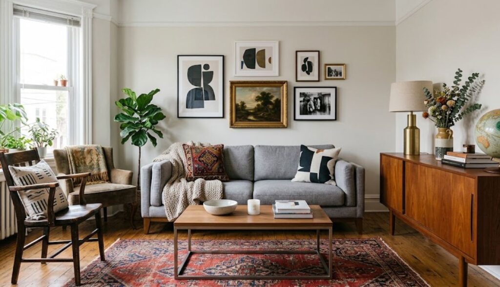
You don’t have to buy everything secondhand. A modern sofa can work with an antique wooden table. Contemporary lighting can complement traditional architecture. A minimalist desk can sit comfortably beside a vintage bookcase.
This mixture is important because a room composed entirely of historical-looking pieces can feel artificial. The best interiors combine eras.
A useful formula is: 70% timeless foundation + 20% vintage character + 10% modern practicality. That might mean a classic neutral sofa, vintage desk, modern charging station, and antique-style artwork. The result feels authentic because it accommodates real life.
Natural Materials and Sustainability
Natural materials reinforce the visual language of Light Academia Colors.
Look for:
- Solid or veneered wood
- Linen
- Cotton
- Wool
- Ceramic
- Stone
- Rattan
- Brass
- Glass
Whenever possible, consider repairing, reusing, or buying secondhand furniture. Vintage pieces often provide more personality than mass-produced alternatives, and small imperfections can make the room feel warmer. For instance, a scratched wooden desk may have more character than a flawless imitation of one.
Small Details Matter
You don’t need to renovate an entire room. Start with one surface.
A desk can become a miniature light academia vignette with:
- A warm lamp
- A stack of books
- A ceramic cup
- A small framed print
- A wooden tray
- A plant or dried botanical
That’s enough to change the atmosphere.
Common Light Academia Design Mistakes
Even a beautiful palette can lose its impact when overused.
Mistake 1: Using Only Beige
A completely beige room can become flat. Introduce contrast through walnut, sage, dusty blue, brass, or artwork.
Mistake 2: Making Everything Look Antique
The goal is not to create a historical replica. Include contemporary necessities and comfortable furniture.
Mistake 3: Ignoring Lighting
A beautiful cream room under cold, bright lighting won’t produce the desired atmosphere. Use warm, layered illumination.
Mistake 4: Overdecorating
Books, artwork, ceramics, and vintage objects are useful, but too many can create clutter. Give important objects space.
Mistake 5: Choosing Colors Without Considering Natural Light
Paint should always be evaluated under the room’s actual lighting conditions. A color that looks creamy in a showroom may appear gray or yellow at home.
How to Build the Palette Step by Step
If you’re starting from scratch, don’t buy everything at once.
Step 1: Choose the Main Neutral
Select ivory, cream, warm white, or beige.
Step 2: Pick One Dark Anchor
Choose walnut, espresso brown, or another warm wood tone.
Step 3: Add Two Muted Accents
Sage and dusty blue are reliable choices.
Step 4: Introduce Metal
Antique brass, aged bronze, or warm gold can provide subtle shine.
Step 5: Layer Texture
Add linen, wool, cotton, wood, ceramic, and glass.
Step 6: Add Personal Objects
Finally, introduce books, artwork, photographs, stationery, plants, and collected objects. This process prevents impulsive purchases and creates a more coherent room.
25 Powerful Light Academia Design Ideas
- Paint walls warm ivory.
- Add walnut shelving.
- Use linen curtains.
- Display well-loved books.
- Choose antique-brass lighting.
- Introduce muted sage cushions.
- Add dusty-blue artwork.
- Use faded floral textiles.
- Place a vintage-style mirror near a window.
- Add a traditional writing desk.
- Layer a faded patterned rug.
- Display botanical illustrations.
- Use ceramic vases.
- Mix wood tones carefully.
- Add a comfortable reading chair.
- Choose warm rather than cool lighting.
- Frame handwritten or typographic art.
- Decorate with a classic clock.
- Add fresh or dried flowers.
- Use cream-colored upholstery.
- Introduce subtle terracotta accents.
- Combine modern and vintage furniture.
- Keep technology visually organized.
- Leave negative space on shelves.
- Choose objects that tell a personal story.
Light Academia Colors for Different Moods
| Desired Mood | Recommended Colors | Supporting Materials |
| Calm | Ivory, sage, beige | Linen, oak |
| Romantic | Cream, dusty rose, taupe | Velvet, brass |
| Scholarly | Ivory, walnut, dusty blue | Leather-style finishes, wood |
| Natural | Oatmeal, sage, warm brown | Rattan, wool |
| Elegant | Cream, taupe, antique brass | Marble, velvet |
| Vintage | Beige, faded blue, terracotta | Aged wood, ceramics |
The key is moderation. Light Academia Colors should support the room rather than compete with its furniture and architectural features.
Frequently Asked Questions
What are the main Light Academia Colors?
The main Light Academia Colors include warm ivory, cream, beige, oatmeal, taupe, walnut brown, muted sage, dusty blue, dusty rose, and soft terracotta. These shades create a bright but nostalgic atmosphere.
Is light academia the same as dark academia?
No. Both styles draw inspiration from literature, history, classical education, and vintage interiors. Light academia emphasizes brighter neutrals and muted pastels, while dark academia relies more heavily on deep browns, black, forest green, burgundy, and navy.
What color should I paint a light academia room?
Warm ivory, cream, soft beige, or pale taupe are excellent starting points. The best choice depends on natural light, flooring, furniture, and the room’s size.
Can I use modern furniture in light academia?
Absolutely. Modern furniture can prevent the room from feeling like a historical recreation. Combine clean contemporary pieces with traditional materials, artwork, books, and vintage-inspired accessories.
What wood works best with light academia?
Walnut, oak, aged pine, and warm medium-brown finishes work particularly well. Choose wood with visible grain and avoid overly glossy finishes if you want a softer appearance.
How can I create the style on a small budget?
Start with inexpensive changes such as cream textiles, secondhand books, framed artwork, warm lighting, ceramic accessories, and thrifted wooden furniture. You don’t need a complete renovation.
Does light academia work in small rooms?
Yes. The brighter palette can make small rooms feel open. Use warm light colors on walls, avoid excessive furniture, and use mirrors to reflect daylight.
Can I use black in a light academia room?
Yes, but use it as a small accent. Black picture frames, hardware, or a lamp can provide contrast without shifting the room toward dark academia.
Are plants suitable for light academia?
Yes. Green plants, herbs, dried flowers, and botanical arrangements complement the natural and scholarly character of the style.
How do I prevent the room from looking too themed?
Prioritize your actual lifestyle. Choose useful furniture, display meaningful objects, and mix old and new pieces. A restrained approach usually feels more sophisticated than decorating every surface around the theme.
Conclusion
The beauty of light academia lies in its balance. It combines the intellectual charm of traditional study spaces with the warmth and brightness of modern living. The most effective Light Academia Colors are not necessarily the most complicated. Warm ivory, cream, beige, walnut, muted sage, dusty blue, and faded rose can create an elegant foundation when they’re layered thoughtfully. From there, natural materials, vintage furniture, books, artwork, soft textiles, and warm lighting bring the palette to life.
You don’t need a grand library, expensive antiques, or a historic building to capture the aesthetic. Start small. Change the lighting, introduce a warmer wall color, add a wooden piece of furniture, arrange a few books, and bring in one or two objects that genuinely interest you. After all, the best light academia interiors aren’t simply designed to look scholarly. They look as though someone curious, creative, and thoughtful actually lives there.